Smarter onboarding, simpler forms. See how we improved Kemlu's investment website: Investolink.
Mar 10, 2025
Warcop Studio

Athifah Chairunnisah

First-time users are some of the important people who determine whether your site is a potential hit or miss. Their initial reactions, formed in a matter of seconds, could either lead them to stay, or at worst, click away.
This is the key insight driving our latest collaboration with Indonesia’s Ministry of Foreign Affairs (Kementerian Luar Negeri Indonesia, or Kemlu for short) on the Investolink website, to design a better user education through a UX perspective.
Overview
In 2022, Kemlu launched Investolink, a website designed to track potential inbound and outbound investments in Indonesia. Aside from mapping Indonesia’s potential economic distribution, the platform's core function was also to let users input investment reports through a digital form.
However, many users, including Kemlu and embassy (KBRI) staff, found the website hard to navigate and the form confusing to fill out. This issue resulted in longer report completion and affected their overall productivity.
After gathering feedback through interviews with Kemlu staff and experiencing the site as first-time users, we finally identified the underlying problem: a lack of user education and an unpleasant form design.
So this was our big question: how might we improve user education so that they could navigate the website easily?
We targeted this question especially to first-time users, because as aforementioned they're the ones with the right criteria to determine whether or not the website is intuitive.
Setting up the onboarding
Onboarding is like the opening chapter of a book – you need an introduction to what the story is about, its characters, and a sense of what’s coming next. In UX, this sort of preface will guide users from where they know very little about the product to making the most of it.
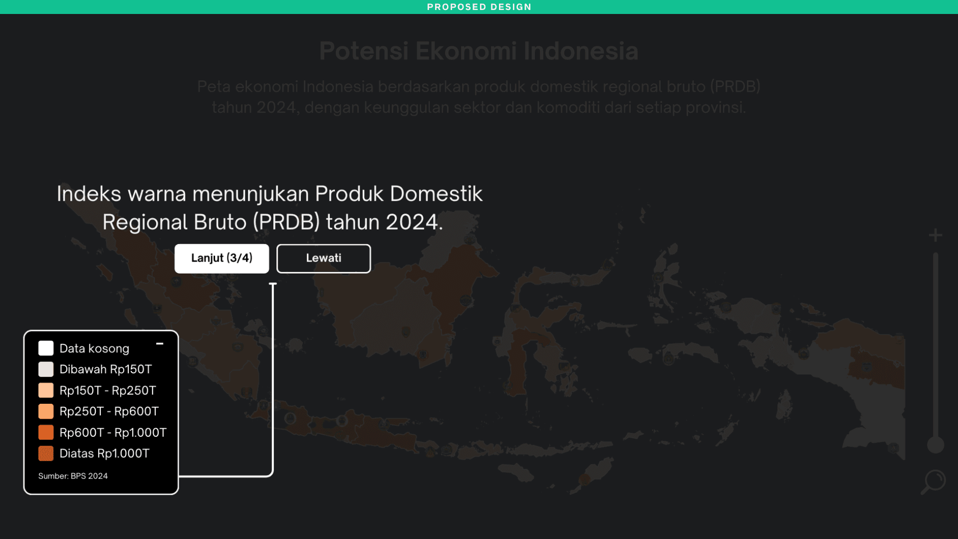
Kemlu’s Investolink homepage greeted users with Indonesia’s Economic Potential Map, featuring icons, legends, and a list of Indonesia’s provincial economic profiles. However, it lacked instructions on how to use the website.

To reduce confusion and guesswork, we proposed several approaches to onboard first-time users. While onboarding can take many forms, we focused on ones that would be the most effective as a starting point.
Onboarding approach #1: entry point to access tutorial video
Most Investolink users were Gen X and Gen Y (baby boomers and early millennials), so a tutorial video would be very helpful for those less familiar with modern user behavior.

Providing a link to the helpdesk tutorial video from the start could be one way. But this might distract users from going back and forth from the homepage to another. Here’s an alternative approach.
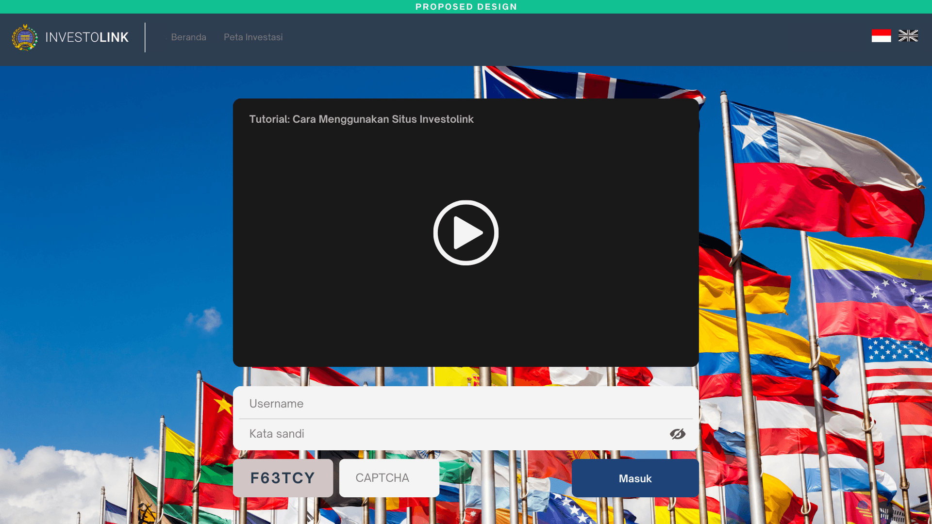
Onboarding approach #2: display a prelogin tutorial video
Instead of relying on users to find and access the tutorial themselves, why not place it front and center? By displaying the tutorial video right before the login page, users are immediately introduced to the platform’s key features and functionality without the hassle of searching for help later.
Onboarding approach #3: step-by-step onboarding
This is a classic onboarding design that is familiar to most users and is effortlessly versatile. Unlike tutorial videos, which are likely exclusive to certain pages or functions, step-by-step onboarding can seamlessly guide users through the entire platform, page by page. And of course, allowing it to be dismissable in case users prefer to skip it.


Designing the form-filling experience
Nobody likes filling out forms, so let’s not make it worse. Good UX focuses on increasing efficiency and minimizing the time it takes to complete. Simply put, making the process as quick and effortless as possible.
However, this form design didn’t quite catch the goal. It felt overwhelming at first glance; there were too many fields to fill on a single page, and this jumbled, two-column layout made it even more confusing to follow.
Form design #1: reduce cognitive load
Our eyes are naturally designed to focus on one thing at a time, looking up and down. Breaking down the form into smaller steps helps ease cognitive load and increase visibility.
For this approach, we used a stepper and divided the form into 3 clear steps. We also switched to a single-column layout and greyed out the next field. This design will help users stay less distracted, leading to an overall improvement in the form-filling experience.

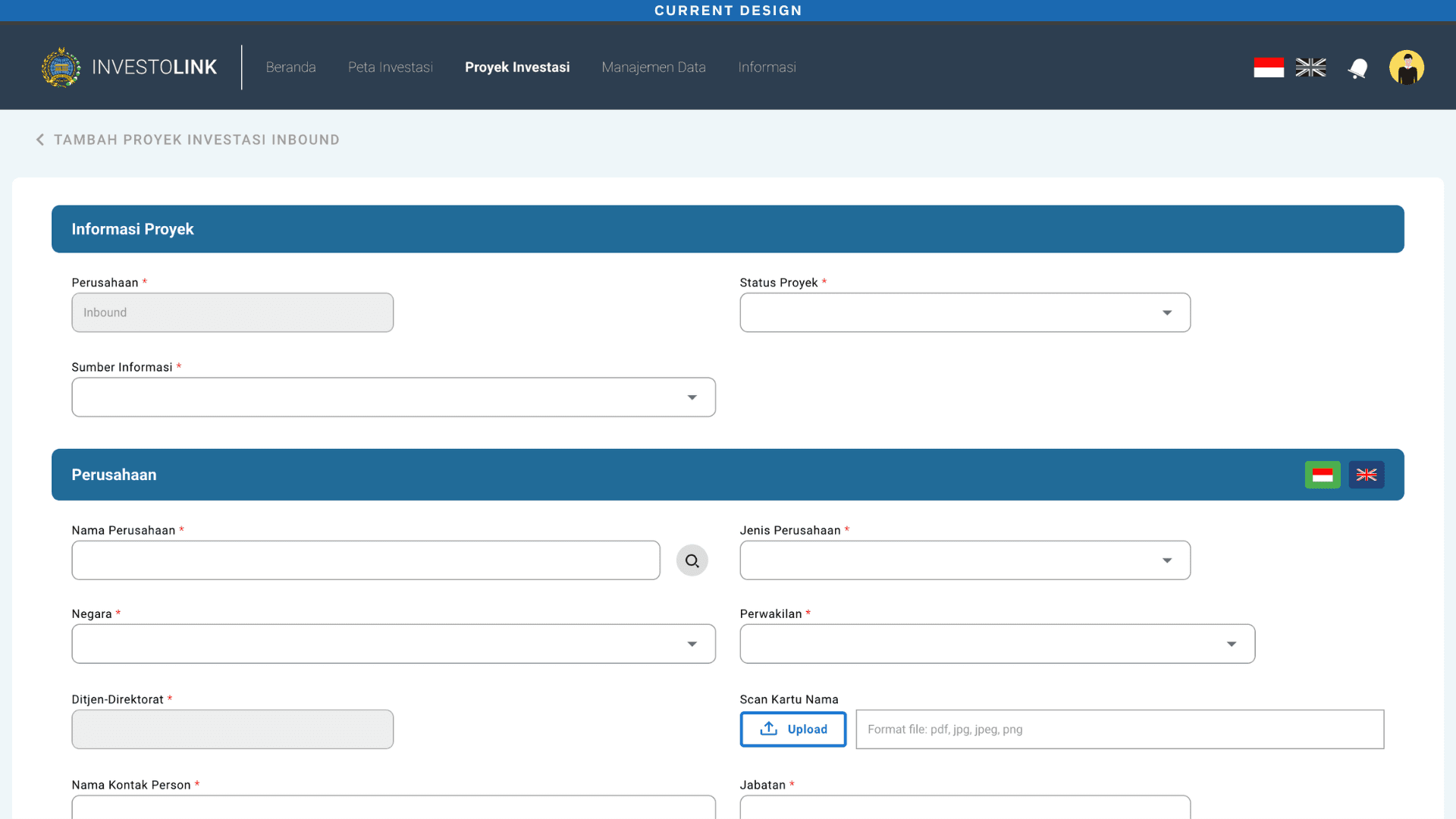
Form design #2: two-column isn’t always bad
Sometimes people really need that much information to gather all the details, and that’s okay. When it’s truly needed, the two-column layout can still be applied.
Considering the number of fields, a single-column layout might create more scrollwork, and that’s also an important aspect to weigh. For this scenario, we opted for a two-column layout and indicated the sequence with numbers to clarify and keep the progress on track. After all those fields, we colored the completed step in green to give users a sense of accomplishment.

What can we learn from this?
Building the onboarding experience is a good start to improving the UX experience. It’s essential, as it’s the first opportunity to educate and familiarize users with your platform.
While clear onboarding steps are essential, ensuring your design aligns with user behavior will also create a positive first impression.
When it comes to forms, ‘less is more’ is probably the best philosophy. The ultimate goal is efficiency, and efficiency means happier users and increased productivity.
Although less is better, it’s also important to consider every aspect possible of the user journey—like keeping the layout clear, even in a two-column layout when it’s truly needed.
Users don’t have much time to guess their way around, and certainly not by wasting it on filling out forms. Let’s make sure they’re guided, not frustrated.
About the author
Athifah is a creative writer with 3+ years of experience in beauty and retail, crafting everything from in-depth articles to punchy social media ads for editorial, marketing, and branding purposes. She's now diving into UX writing to take her skills further. Off the clock, you’ll find her playing with her ginger cat or diving into a mind-twisting book.